Showing posts with label new work. Show all posts

Wednesday, 31 January 2018

Old Quilts from the Guild and New Quilts by me

Two velvet log cabin blocks
I'm going to stop apologising for the time between posts.  Life is, happily, very busy and when it comes to down to do I write a blog post or get things ready for the students due in the next day - class prep wins every time.  
Detail of a sateen wholecloth
So when I can, I'll add a post of happenings.
A coverlet made from shirting samples
In November, to help the C&G Diploma students with their illustrated study of the history of British Quilting, I borrowed a suitcase collection of quilts from the Quilters' Guild.  Over the course of the two week loan period, each group got a chance to see the quilts and the stories about them got developed and embellished, as there is little factual information about their history.  
Detail of a silk hexagon coverlet
Why did the maker of this beautiful silk hexagon quilt stop?  Did she hate making it?  Was she forced by her mother and stopped the moment she left home?  Did her eyesight fail?  Did she fall into poverty and couldn't afford any more ribbons for it, but couldn't make herself cut it up to be used more practically?  Did she pass away and her daughters couldn't bear to continue?  Wondering about the makers is a lot of fun.  It is a shame we know so little, which is why quilt historians are adamant that every quilt should be labelled to help future historians with their musings.  I admit this isn't something I'm always good at.
Detail from another wholecloth, with a heavy wool wadding
To give others who aren't students here a chance to see these quilts, I had an Open Day.  Alongside the antique quilts, I displayed some of my newer pieces.  It was lovely to juxtapose the old and modern, seeing the similarities and the differences.  The cake also went down well, and was definitely kept in a separate room from all these antique quilts!
After everyone had left
Of course, being me, I forgot to take photos when the room was filled with visitors, but it was suitably busy and enjoyable.  The collection, called 'Textile Treasures' is still available to be borrowed from the Guild.  Despite the responsibility of having to look after the antique quilts, I really enjoyed having them here.

Monday, 16 January 2017

Hepworth inspired stone quilts

Version 1
CQ, the contemporary group of the British Quilters' Guild had a call out for A3 sized pieces inspired by a favourite artist for their new suitcase collection.  
As I love art and the size was not painful, it seemed a good thing to do, although choosing an artist took me ages - who actually is my favourite artist? I like the work of so many.  Should I choose someone instantly recognisable or go for a contemporary artist no-one would have heard of or, or, or...  Too much choice.  So I prevaricated, until one day I opened an old sketchbook and found a photo of a sculpture by Barbara Hepworth and thought it would make a great starting point for a quilt.  It was a piece I had seen at the Hepworth late 2015 and it reminded me of the many drawings I was making of stones.  I liked the idea of choosing Barbara Hepworth - well known, but not too well known and also a female artist as the majority people have heard of are men.  
I had got very excited when I saw her sculptures for the first time at the Yorkshire Sculpture Park of shapes with holes, especially as I was making images of people with holes at that time.
Computer drawings
From my initial drawings I tried out some colour combinations on the computer to fit in with some ideas I was working with.
Trying out the fabrics
I had some left over fabric from another piece, which was breakdown printed, discharged out some colour and added some gorgeous kimono silk I had purchased from Susan Briscoe.  
Quilting pattern sketch
I liked the way the colours were working but couldn't decide on the quilting pattern, so did a number of sketches.  I liked one, R preferred another. 
Another quilting pattern sketch

In the end, I made a second, smaller version for the SAQA Suitcase Collection, so got to try out two quilting patterns.  Which one do you prefer?

Version 2


Monday, 14 March 2016

Things to do with Gelli Plate Prints - 3 Make Quilts

Having spent the other weekend at the SECC showing people how to use Gelli Plates and making lots more prints in the process, I thought it was time for another in the series of what to do with the prints once you have them.  This time I'm suggesting you make a quilt.
Bamboo Beauty by Gillian Cooper

This was one of my new quilts which was on show for the first time at the SECC as part of the Turning Point display and the background was made entirely from Gelli Plate Prints on fabric.
 I showed you how to Gelli Plate print in this blog post here, using the bamboo as an example.
 I deliberately printed onto dyed fabric as I seem to have something against white at the moment!  I had a big pile of prints on a variety of different fabrics.  
To make things easier for the piecing, I decided to piece them into columns.  Each column was a different width, but it stayed the same width all the way down.  I put the prints on my design wall to decide upon the layout, then pieced them all together.  I had intended to use a variety of fabrics, but in the end, I liked the simplicity of the prints on cotton.

Rather than add the different fabric prints, I added several pieces of sheer with bamboo leaf shapes cut out from it.

This is becoming like a game of spot the difference between the photos!  As the quilt was going in a group show, it had to be a specific size, so I trimmed it to fit.  I felt it needed something else on top.  I had always envisioned black bamboo on the top, but then I discovered my roll of purple and blue silk sari strips and fancied trying those.  I didn't think the colour contrast would be sufficient, but I really liked the strips, so wanted to give it a go.
I was right  - it didn't work!  Also, the shape of the leaves were not quite right, so I redrew it and cut it out of black fabric.  I will eventually Gelli Plate 
print a background for the purple/blue leaf.
I liked it a lot better and spent quite a time considering whether anything else was needed.  I decided to leave it (either less is more or I was worried about spoiling a quilt when I didn't have time to make another!).  All that needed to be added was the black binding.  Originally I was going to bind the edges using the same fabric as the prints, but it needed the black to pull in the leaf.
I now have several prints left over to play with further and lots of bamboo shoots cut out from sheers!

Thursday, 3 September 2015

Facing Time - a new work

Facing Time by Gillian Cooper

How much is enough?  I don't think there is any possible answer to this as an artist.  It is two weeks until the European Patchwork Meeting and I am still creating new pieces.  Originally I thought this didn't look very professional, but now I realise that it is part of being an artist - I can always make one more piece; I always have another fantastic new idea to try.  And I'm nowhere near finished with 'Unsung Muses' yet. So many possibilities and a deadline.  The perfect conditions for me to make work!
So here is another new finished piece.  I had a definite vision for this one from the start.  A few months ago, I was looking through an old sketchbook at some drawings and one jumped out at me.  
Original drawing (after I've played with it with some image manipulation software)

After redrawing it several times, I knew it was perfect for development, using similar techniques to those I had used in 'Elements of Our Past'. 


Full sized drawing on the wall
I pieced it together out of large patches of hand dyed fabric, working tonally from a full scale drawing. 


Some of the fabric I considered
I then used free machine stitching to add the detail and define the shapes and to hopefully give it a sort of sketchy feel.  I wanted the face to look human, but not too human and not to be over-defined, as it is coming from long ago.
In progress

Some of these fabrics were dyed seven years ago.  It is was good to use them and I really like the soft colour palette I achieved then.  I'm racking my brain to work out what dye shades I used so I can make some more of them, but as I didn't dye them at home it won't be straightforward. As I'm teaching dyeing to my C&G Certificate group this weekend, I may have a bash at it.
Detail of  'Facing Time' by Gillian Cooper

That's another of the new pieces.  I have four or five others at various stages of completion and another three or four in my brain.  Given I have eight days until we leave, and miracles are rare events, even in my most optimistic state, I don't think they will all be finished.  It's not like I actually need them - I already have sufficient work, but the joy of being an artist is I can always do more...

Monday, 24 August 2015

SpongeBob's friend meets the Minions - a new work

Elements of Our Past by Gillian Cooper 2015
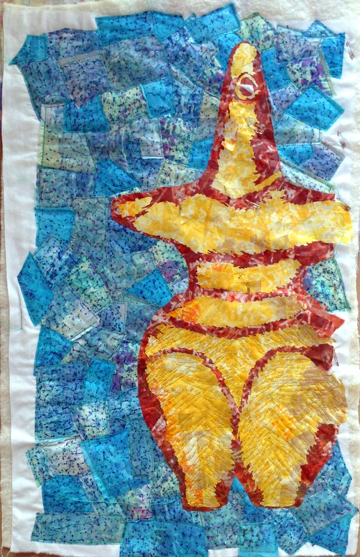
This is my latest piece.  I’m calling it ‘Elements of Our Past’, but the kids are referring to it as ‘Patrick from SpongeBob meets the Minions’.  It is based on an Ancient Greek sculpture – I really liked the shape, so I drew it out a couple of times, then redrew it to full size on lining paper.  
The original drawing
As soon as the kids saw it on my wall, rather than complimenting me on the lovely shape, they all said ‘It’s Patrick, SpongeBob's friend’.  TV has a lot to answer for.
Screen printing the fabric
All the fabric was hand dyed and then screen printed with thickened dyes using shredded paper as a mask (thanks Catherine!).  I ironed fusible webbing on to back of the fabric and cut it into patches and ironed them in place. 
All ready for the final stitching
Using mainly thicker than normal thread (a Wonderfil speciality that Mags Ramsay put me onto at last year’s Festival of Quilts – thanks Mags), I free machined over the figure to give it more definition.  I really like the ‘sketch-like’ effect of these lines. 
Stitching in progress
Once it was finished and up on the wall, one of the kids came in and admired it.  Great, I thought, finally appreciation for my art.  He said: ‘You know Mum, it doesn’t look like Patrick any more, it’s much better.  It looks like a Minion too...’

I hope that you will see my ‘Unsung Muse’ in this piece, the ancient eternal goddess and not just a mixture of kids’ cartoon figures!

Detail of 'Elements of Our Past'


Wednesday, 4 February 2015

Design decisions: the making of Fractured

Fractured by Gillian Cooper
Sharp eyed readers may have noticed on my photos of my exhibition at the Scottish StorytellingCentre that there was another new piece of work there which I haven't written about.  It is a piece I have been intending to make for ages, but I only finished it at the very last moment (the day before I hung the show).
It started life on my floor drawn out on lining paper and I walked over it for several weeks, before it got so grubby and damaged I decided to start again. 
Second version of the figure
I also think that I had been holding back making it because I wasn’t completely convinced of the design and needed to think through all the technicalities of how I was going to make it.  So it was redrawn and I then made the figure shape.
Cutting the figure
The kids were horrified when I took the scissors to it and cut it into the pieces.  
The chopped up figure
Originally, I was going to stitch it to strips of patched silk.  This then changed to clustered pieces.  Finally, I decided to make the silk as one complete background.  
Stitching the silk background
The mega downside of this was the size, especially as I was using Vilene as a backing as it was very difficult to manipulate under the sewing machine.  I made it in two long strips, then stitched them together.
Tacking the two strips together
So I added the figure onto this background, played around with where the pieces were going to go, stood back... and... realised that it didn’t work.  
Before adjusting the tonal balance
I photographed it to confirm that it didn’t work and made it black and white.  
The black and white version
Which just proved it further.  There wasn’t sufficient tone differentiation between the background and the foreground. 
With the organza over the background
I tried adding a pale blue organza layer over the background, but it didn't make enough difference.
With rapid haste, the background got made lighter with paintstiks, which also added more texture, thus improving the piece.  The figure was darkened by overpainting, several times to get a darker shade.
The figure exploding out over the background
When I put it back together again, the next decision was exactly how to layout the figure pieces.  I decided to make it easy to read as a figure, rather than having them spread out more randomly as shown above.  Which do you think is better?
Stitching the figure to the background

These were stitched down in place and the piece made ready for hanging, with all of several hours to spare.  It is rather big (8 feet high) and I’m not sure I want to make another piece so large, but I do like the idea of the fractured figure, so I think there may be further versions of this to come.

Monday, 12 January 2015

Friend or foe? New work


Meet the latest in my series of ‘Unsung Muses’. Not sure whether she is friendly or scary, but I'd definitely want her on my side! She’s not formally named yet and there may still be some changes, but for the moment, she is sat on my wall to be contemplated.  You may be able to see some pins around the edges of the piece as I have been trying to block the hanging into a less wavy shape.

She has taken a long time to make, partly as I tried to make a darker figure on a lighter background – instinctively I want to make it the other way around, but I keep reading (a dangerous thing) that dark stands out better on a light background rather than the reverse.  The background felt too weak, so got improved, several times, with inktense and with stitch.  The breasts were too bright, so the colour got knocked back by adding some chiffon on top.  The edges changed shape a couple of times.

This may tell you that I’m still a bit unsure of this piece.  Therefore it is time to leave it alone and mull it over whilst I get on with the next one, which is well underway as it seemed more fun to start another piece than to battle on with something I was unsure on.


Friday, 21 November 2014

The Big Reveal: New Collection of Small Works

Forgotten Figures I by Gillian Cooper
Finally, I’ve finished some of the series of smaller pieces I’ve been working on.  And here they are.  Each of these pieces is 8x6in – the smallest I’ve ever made.
Forgotten Figures II by Gillian Cooper
I’ve really enjoyed working small.  I love the speed (there are about another 15-20 in progress as well as these ones) and playing around with composition by cropping the slightly larger pieces to fit within the frame.  All of these are now mounted ready for sale at Holmwood House on Sunday (and afterwards).  Come and see me at Holmwood House in Glasgow on Sunday afternoon if you have time and you will see exactly how these pieces were made.
Forgotten Figures III by Gillian Cooper
These pieces are all wholecloth too – no piecing before I printed, painted, stencilled and stitched.  In some ways I think I would be too precious with a piece I had already made to stick it onto the printing plate just to see what happens.  Perhaps that will change with experience, but for 8x6in there are already a lot of techniques involved, so I’m not convinced it would add anything. 
Forgotten Figures IV by Gillian Cooper
I’ve also altered my colour palette to some extent.  Other people have been commenting on this rather than me, as to me it seems entirely natural and not really anything different to what I was doing.  This is where the insights of others come in handy.  Do you have any views on these pieces?

Forgotten Figures V by Gillian Cooper
I intend adding them to my website for sale sometime soon and reviving my Etsy shop to start being a bit more commercial about my art.  There.  I’ve stated it.  Now I have to go through with it as I’ve put it in black and white.  I still want to make totally unsellable installations, but even I don’t have them on permanent display in my house so I can hardly expect others to do the same and it would be nice to have some room under our bed/in our garage/under the stairs again rather than it being taken up with artwork.
Forgotten Figures VI by Gillian Cooper

Related Posts Plugin for WordPress, Blogger...

Popular Posts